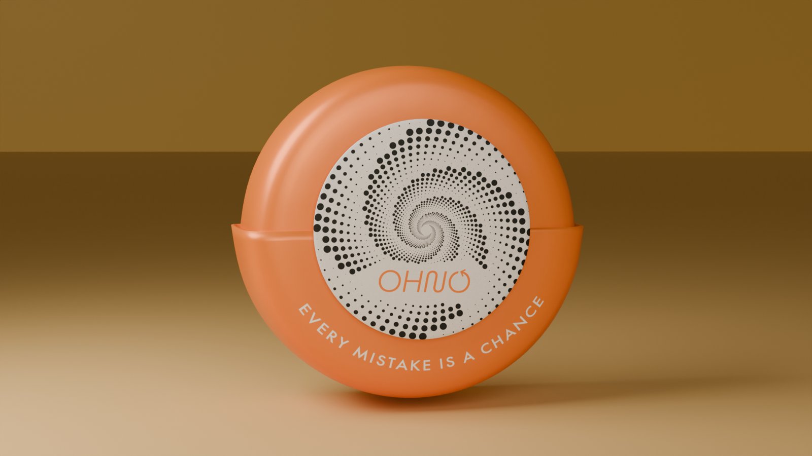
The idea. OHNO is a fictional brand built on one thought: what if you could take time back and undo a mistake? The whole identity turns an "oh no" moment into a promise — every mistake is a chance.
My role. Individual graphic design project at ITU. I developed the concept, the logotype and type system, the color palette, the character illustration and every packaging application from scratch.
01 — Concept
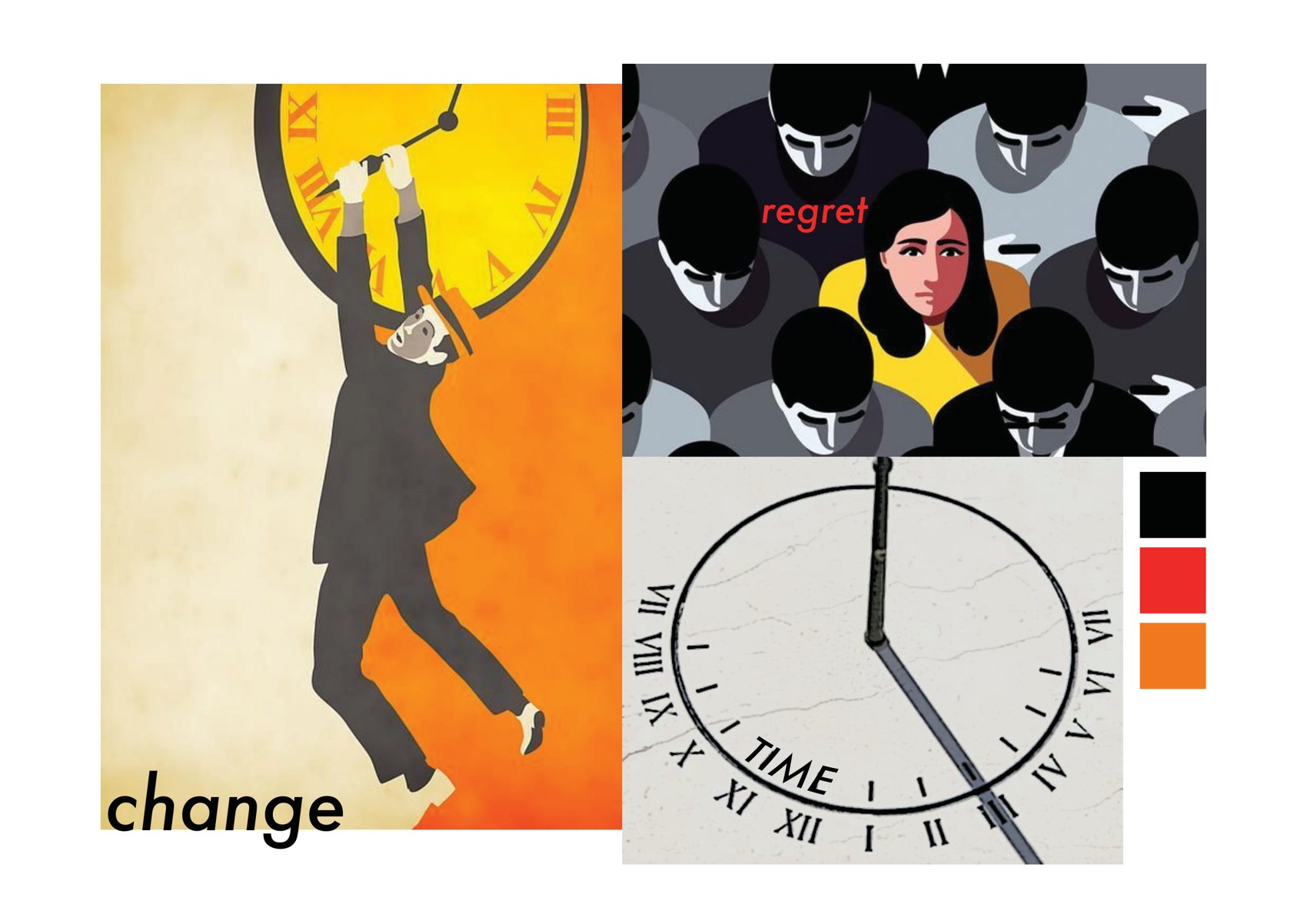
From "oh no" to "every mistake is a chance."
The starting point was the tension between regret and change — that split-second wish to rewind. The brand answers it with humour rather than guilt.
02 — Logo & identity
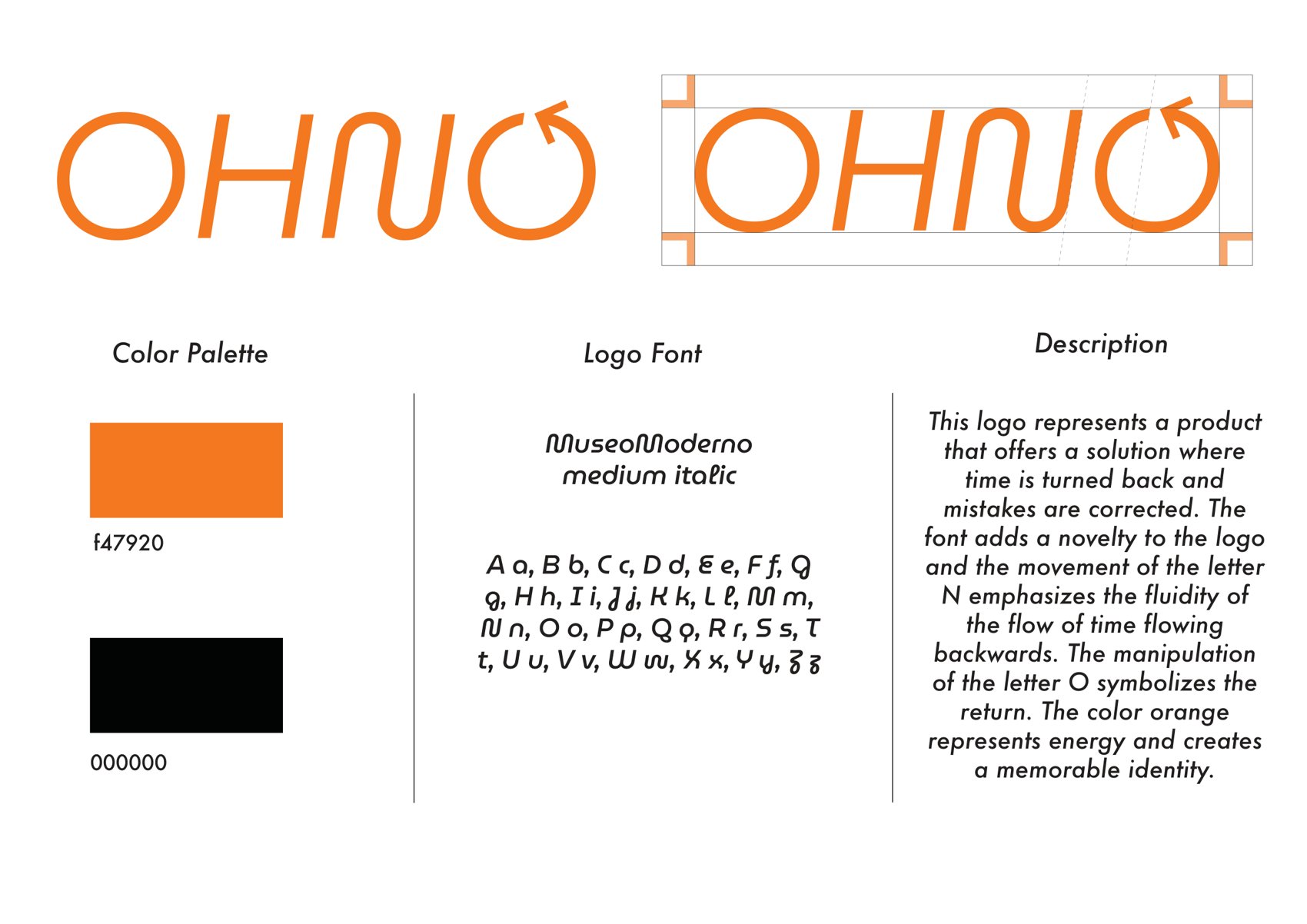
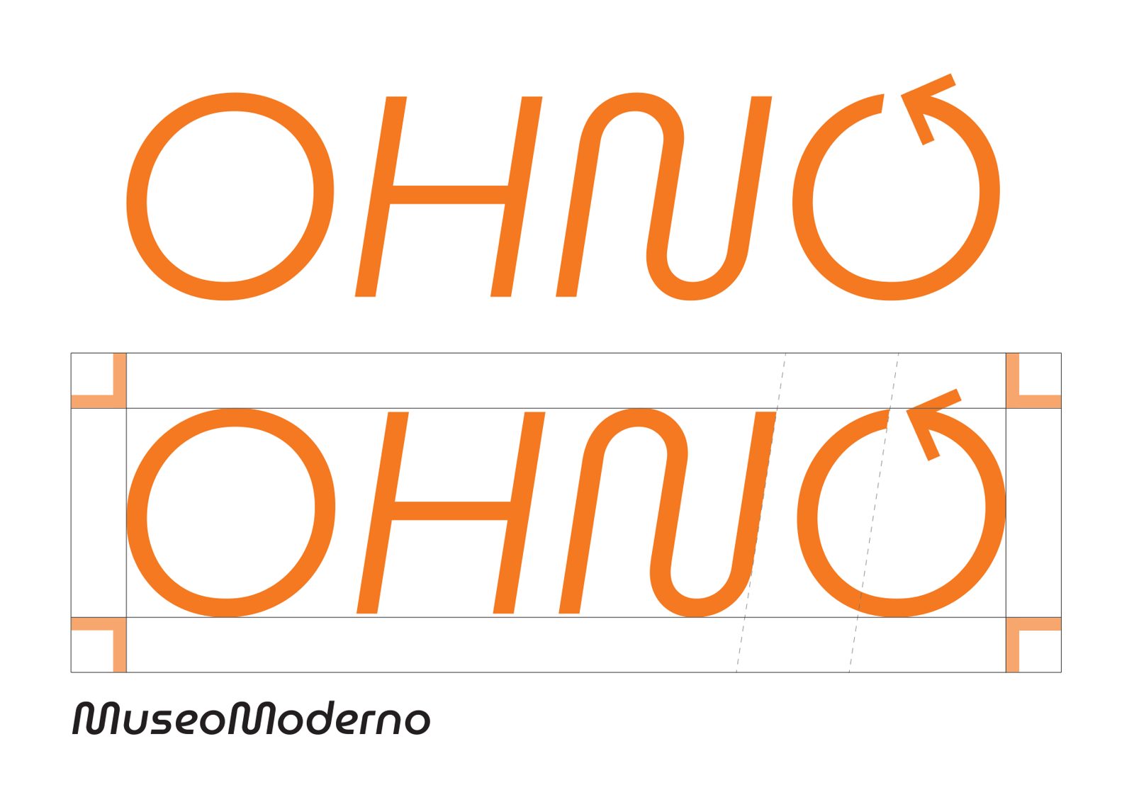
The logotype is set in MuseoModerno Medium Italic. The final "O" is drawn as a rotating arrow — a clock winding backwards — so the mark itself carries the idea of reversing time. A bold orange (#F47920) against black gives it energy and a memorable, single-color signature.
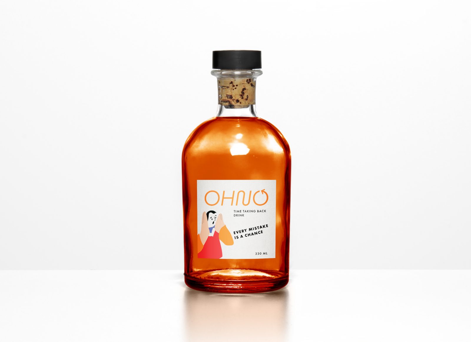
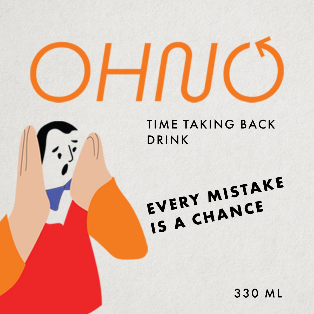
03 — Time Taking Back Drink
The hero product: a 330 ml orange drink. A character mid-"oh no", the tagline "every mistake is a chance", and a full front-and-back label system with real ingredient and category information.
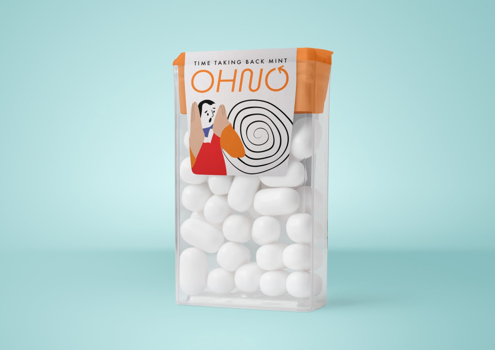
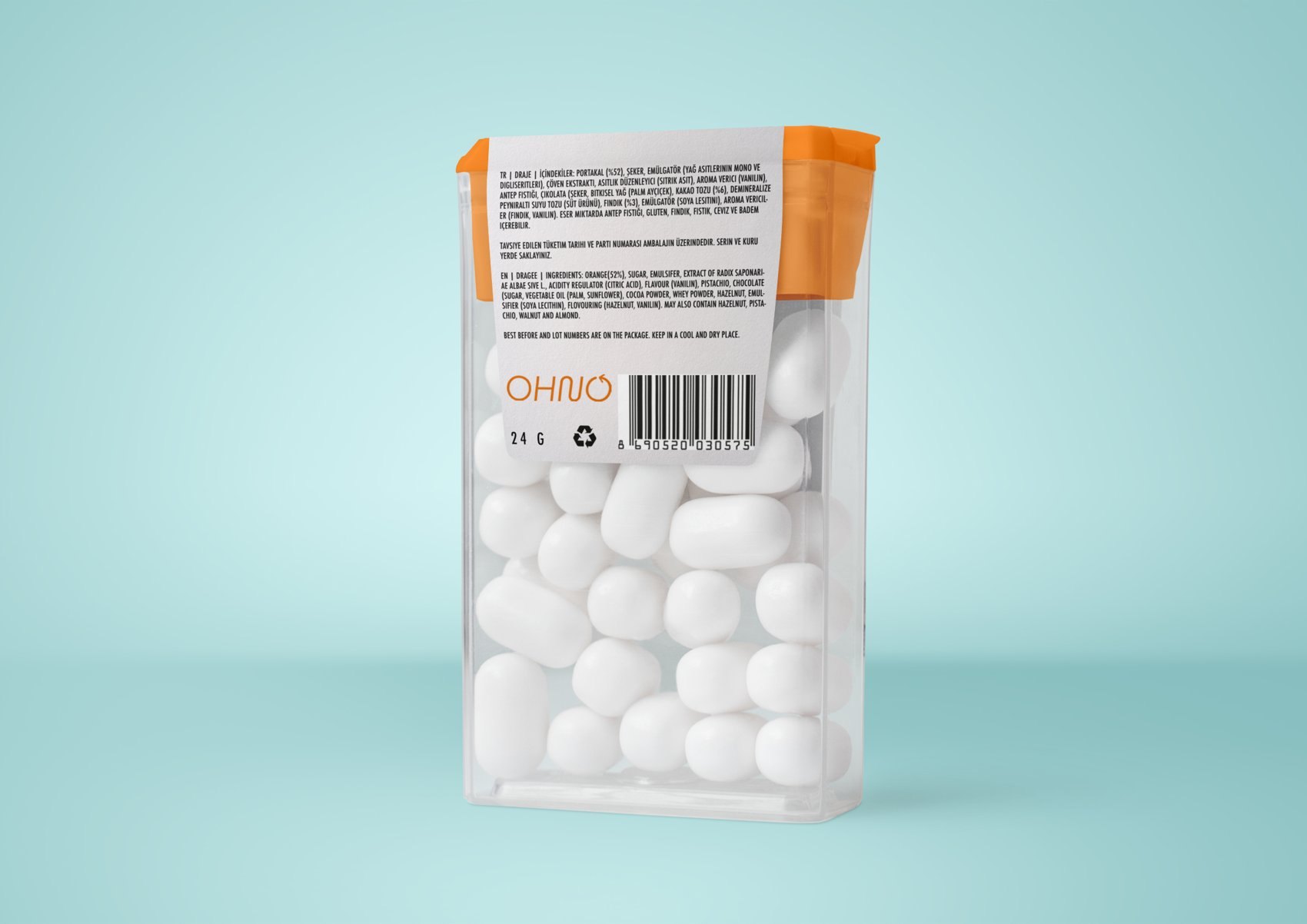
04 — Time Taking Back Mint
The identity extends to a mint (draje) package — same character, same orange, resized and re-laid out for a small pocket format with its own front and back.
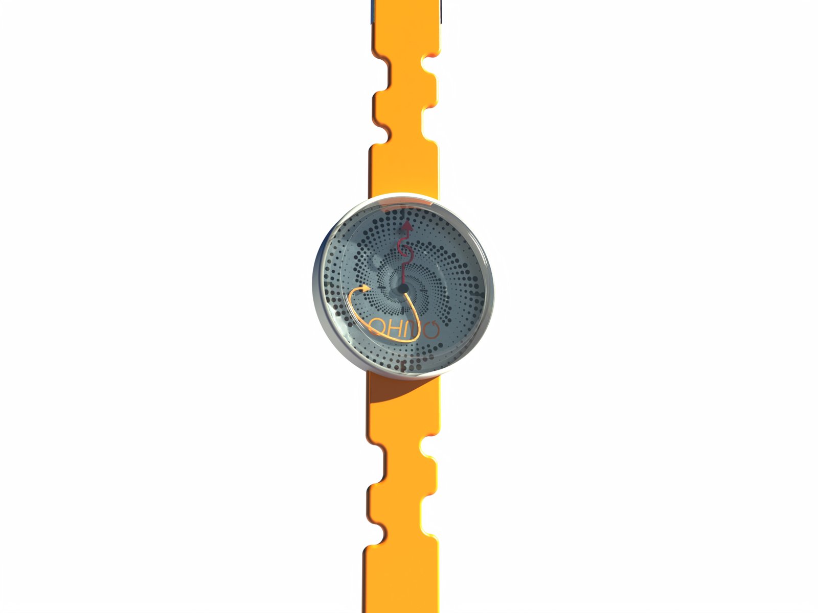
05 — The watch
A closing object that makes the concept literal: a wristwatch that turns back time. When you're in trouble, set the clock and go back. It ships in its own round OHNO case.